In a few word
The Pareto principle, also called the 80/20 law, estimates that if you act on 20% of your causes allows you to resolve 80% of the effects.
This principle was created by the Italian engineer Vilfredo Pareto, who based on studies on the distribution of wealth in Italy found that 20% of people own 80% of the wealth.
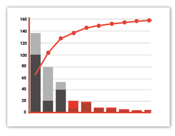
The Pareto chart is the tool that highlights this principle with a graphic representation. Presented in the form of a histogram, it shows the importance of the different causes of a phenomenon. This histogram graphically illustrates the hierarchy of causes to be treated in order to concentrate efforts on 20% of the causes that will produce 80% of the effects.
The bars of the histogram are sorted in descending order and accompanied by a curve of the cumulative values of the bars.
The Pareto chart is a very popular tool, because many phenomena follow Pareto’s law, so it’s used in many fields like industry, marketing, or management.